I can’t remember the last time I picked up a paint brush to create something I found inspiring. It’s been too many years, that’s for sure. After a few years of creating technical illustrations of my observations, I’ve really gotten the urge to do something a bit more creative here and there. I used to paint with watercolor, but the thought of doing night-sky paintings with that medium sounded too much like hard work to me. I’ve never taken the time to practice and learn oil or acrylic painting until now. So I started doing some research and last month I picked up some tubes of acrylic paint, a couple brushes I could dedicate to it, some priming gesso, and some parchment paper & tupperware containers to make stay-wet palettes. Then last week, I picked up a few 12″ x 16″ pre-primed canvas boards (not framed canvas–yet).
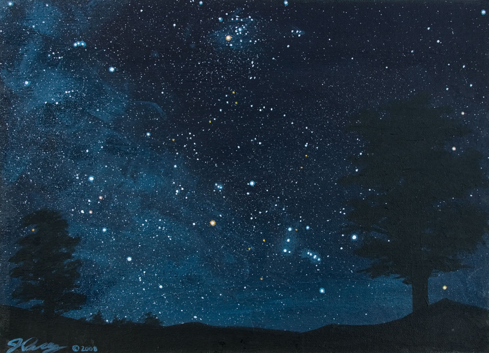
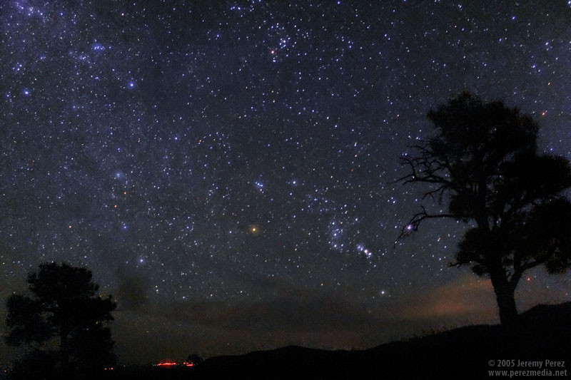
Saturday night, I went to work on a painting of Orion, the Hyades, and the Winter Milky Way rising at Cinder Hills Overlook. It’s based on a photo I shot from that spot about three years ago. I had re-worked that photo earlier last week too, and was feeling a groove getting started. Wow it felt great to whisk paint across that canvas. I was curious to see how well I could balance keeping the field ‘loose’ while still portraying a reasonably faithful star field.
So, for my first canvas acrylic astro painting, I learned a few things right away. Here is what I did, and what I figured out along the way.
- I’m going to have to learn to put away feelings of stinginess with the paint when applying the background for the sky. When I laid down my first layer, I thought I could progressively dilute a modest amount of paint with water as I went down the canvas, in an attempt to create a skyglow gradient. That went horribly 🙂 So I let that splotchy mess dry, and came back in with another layer. This time I gooshed out a nice pile of Ivory Black and Phthalo Blue, mixed it up for maximum creaminess, and then gradually added white as I went down. This time the paint went on wonderfully…I think ‘delicious’ is a word I could use to describe the feeling of brushing it on and watching the gradient and brush strokes take shape.
- Then, using the same level of lightness as the skyglow at the bottom of the painting, I loosely brushed in the clumpy haze of the Milky Way. I really had the urge to incorporate the patches of dark nebulosity in all the right places. However, I quickly realized that if I tried to do that, the Milky Way would look stiff and overly-artificial. So I kept it loose and impressionistic.
- While that base layer dried, I used a small round brush, and a mix of paint slightly lighter than the Milky way to dab in the framework stars. I referred to the photo as it was displayed on my computer screen to position the stars. I used basically the same process I do when sketching: comparing angles, distances and magnitudes. I didn’t get crazy with making this absolutely precise. I wanted it to be faithful to this swath of sky, without becoming a technical reproduction.
- Then came the scary part. Sprinkling in the explosion of faint field stars that help make dark sky views so captivating. I found an old-style toothbrush (not one of the new-fangled ones with the big rod of bristles at the tip). Then I loaded it with white paint and practiced using a palette knife to sprinkle it on some newspaper. I messed with the consistency a bit and then I went for it on the actual painting. This was just a little bit stressful. Toothbrush sprinkling is not meant for the control freak. But I know it can be guided. I think I did fairly well increasing the density of the spray across the Milky Way portion, but I unintentionally put a heavier density across the center and upper right portion. Oh well. I did notice that pure white was not the best choice for these field stars. It’s too overwhelming. Next time, I’ll use a medium gray or blue.
- Next I went in and brightened up the key stars I had hinted in earlier. Adding the orange stars really did it for me and I felt it conveyed the scene the way I had hoped. I ‘haloed’ the brightest stars with medium blue and medium orange, and then plotted varying sizes of white in the center to hopefully convey both brilliance and color at the same time. I do need to pay attention to where I’m going to add my foreground so that I can subdue the brightness of the stars closer to the horizon. The stars in the painting are too crisp and bright that far down.
- Last to be added was the foreground. And here is where I fell down: Trees. I thought the two trees I wanted to add would be simple. But I couldn’t get the paint consistency and brush behavior to do what I wanted. The branches kept coming out too thick and fake looking. So I ended up adding much more foliage to them than I wanted, just so I could hide the stupid branches. I definitely need to practice with trunk, branch & foliage painting so I can get a feel for it. I also think that using a palette knife or a rubber color-pusher on the branches might give me more delicate, angular lines. I also just need to study Ponderosa, Piñon, and Juniper pines like I would one of my deep sky observations so I can learn their peculiarities.
- Oh man. Then there’s the border taping fiasco. I always liked the look of a white margin around my watercolor paintings after lifting the tape from their edges. So I had applied watercolor tape to the edges of the canvas board to get the same effect. HUGE mistake. The moistened glue interacted with the pre-primed surface and cemented the tape in place. I had to put a lot of effort into wedging a wetted paintbrush beneath the edges of the tape and gradually peeling it away and then using an Xacto knife and water to lift away the stubborn bits. Never again.
- Oh yeah. I’m not used to signing my name with acrylic and a paint brush. So, kind of a little grade school touch there.
So that’s it for my first astro painting. I hope to apply my observing experiences do more of them as I get the chance. Below is the photo on which I based the painting:
Very impressive! Orion rising on a dark night is always a beautiful sight, worthy of a cherished memory.
Magnificent! I’ve tried this sort of thing in the (distant) past with oils and was not impressed with my results…
And, yeah, twigs are a nuisance no matter what. The lines always need to be thinner and straighter than what ends up on the canvas.
I hope you’ll keep doing these!
Eric
Thanks, guys!
I agree Andrew. Orion is such a striking sight when it’s looming over the horizon–it was hard to resist making that my first attempt.
I did a lot of thinking about whether to go with oils or acrylics. I think the oils would have allowed richer, deeper colors, and would definitely stay workable longer on the canvas. I ended up going with the acrylics though for a few reasons. Easier cleanup, low odor, & short drying time mixed with the fact I don’t have room for a ‘studio’. All of this happens in the living room next to my computer desk. The acrylics behaved nicely with just a newspaper & huge old towel to protect the floor & tv-tray I used as a work surface. No complaints from the family about the smell, it cleaned up quickly, and I could move & touch the painting in no time. I got started at 6 pm, and with breaks for dinner & messing around, I was done by midnight. So I guess about 4 hours of actual painting.
I’m going to cut loose on practicing trees next, since they’re going to be in most of the paintings I have in mind. I need to get a feel for swiping those branches in there. I’m sure I can get the hang of it. I mean if there’s nothing else that Bob Ross taught me when I was a kid, it’s that trees are happy, and they have happy little branches. It can’t help but work. 🙂
Jeremy
Since the branches are going to be in silhouette, you might try adding them after the paint dries with an ink pen (such as a Sharpie). That would probably give a little more control than a brush.
Eric
You know, I had actually thought about that. It would feel much more natural to do that with a pen. I was concerned how the finish would look compared to the rest of the painting–would it look flat or satiny compared to the glossy finish of everything else? I’ll need to test it & see. Of course, I could pick up some clear varnish, and just coat everything afterward to tie together any differences.
I think I’m going to give a Color Shaper a try first and see how well it works. I already have one that I picked up a couple years ago to use with pastel lunar drawings…that I ended up doing like one or two of 🙂
The tough part about using the paint brush with such a dark silhouette on an already dark background is that if the paint is thin enough to create a dark line, it isn’t thick enough to show up as a dark line. But when you use it thickly, it makes a big bulb on the tip of the brush. So hopefully the color shaper will work, and if not: on to the pen!
Thanks for the ideas.
Jeremy
Wow! That’s my kind of art. Excellent job!
Thanks Aaron! I appreciate the encouragement 🙂
When I saw this I said “Oh WOW!”. You really have captured the essence of the original photograph. A really fantastic work of art!
Ewan, thanks very much! I’m glad you liked it.
Hi Jeremy Perez
At first, gratulation for your wonderful Website. Unblievable!!
I would like your Orion Painting “Cinder Hills”for a power point desertation!!! Its a very beautiful Painting. Thats a dream for even hobby astronomer!!
http://www.perezmedia.net/beltofvenus/archives/000840.html
Is this ok for you????
LG von Hajü
http://www.astromerk.de
Hello LG von Hajü, I’m glad you enjoyed the painting! If the presentation is for a non-profit purpose, please feel free to use it, and thanks very much for asking.