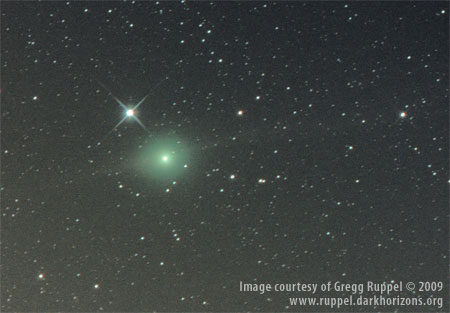
One of the enjoyable parts about making a visual comet observation is seeing how well subtly observed details compare to images taken during the same time period. This often mean waiting a day or two for those images to start posting to the web. So after observing C/2007 N3 (Lulin), I was very pleased to see the following image taken January 8, 2009, by Gregg Ruppel of St. Louis, Missouri, USA.

Above image published with permission of Gregg Ruppel
Move mouse over image to view comparison with the sketch
Click image to link to larger version at Gregg’s website.
It was taken a day earlier, but is still in the same field with 47 Librae. One of the things I appreciate about Gregg’s image is that it compares well with the visual characteristics of the comet, including color, condensation, and relative luminosity of the tails to the coma. Many images are adjusted so strongly to bring out detail in the tail features, that the tails appear almost as bright as the coma and the coma is often blown out–so it’s difficult to assess the overall visual characteristics of the comet. (not to say I don’t like those other photos too!) I was pleased to see how well the dust tail I observed compared to Gregg’s image, as well as the eastward elongation of the coma. The ion tail is obviously much fainter visually, and I was off by about 7 degrees on its position angle (I am thinking more and more about investing in a Swan Band filter).
As you look at Gregg’s image, try to visualize what is happening. The comet is moving from left to right as its orbit carries it behind the Earth. As it does this, it deposits a trail of dust that flows away to the left. Meanwhile the solar wind is emanating from the sun on the left and pushing a tail of ionized gasses off to the right. As the comet approaches Earth, the dust tail should appear to lengthen as it becomes less foreshortened. The ion tail on the other hand will appear to shorten as the angle between Sun, Earth and comet appears to push it further behind the coma.
I’ll really be looking forward to the developing images and sketches in the coming weeks.
What I also like about the two images, is that it shows the difficulty of correctly drawing what you see. Even for an experienced artist as you are.
The stars are not always in the right place when you compare them relatively to each other. But the comet is a good representation of the real thing.
Hi Tjeerd, that’s a great point. I try to get proportions as close as I can, particularly for the main subject of the sketch, but I’m not a machine 🙂 I’m trying to get to know the object, to better understand its structure, to see things I otherwise might miss, as well as to capture its aesthetic appearance through the eyepiece. (My current double & multiple star sketches are a little different, since I actually use an astrometric eyepiece to measure them and present them graphically.)
I have a few other rollover images that demonstrate star field difference in sketches compared to photographs:
– Barnard 33 (see 2nd sketch)
– NGC 6520 & Barnard 86(see 2nd sketch)
– NGC 6992/6995(see 1st & 2nd sketches)
Clear skies,
Jeremy