To lay the groundwork for adding color to the stars, I like to soften their edges a bit. The coloring method I use causes color to adhere to varying shades of gray, but leaves the white areas alone. If the star has a pretty hard edge from pure white to pure black, there won’t be much area for the color to get a foothold. So I’ll grab the ‘blur’ tool and give it a light setting of around 10% pressure. Then I zoom in fairly close to the star and run the blur tool around its perimeter a few times (see Figure 5) until it takes on a softness something like you see in the Figure 6.
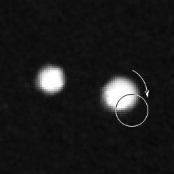
Figure 5
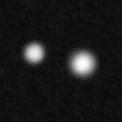
Figure 6
I usually like to adjust contrast and brightness issues at this point. That’s not to say you shouldn’t care for it earlier or later if you would like. But at this stage, you are far enough along to see what will happen to the soft edges you’ve created, and it will give you a good start for the next steps.
To make this adjustment, I suggest avoiding the “brightness/contrast” command, since it doesn’t offer as much control. I personally prefer to use “Curves” to make these adjustments, but this may be more power than you need, particularly if you find the interface intimidating. A good middle of the road tool is “Levels”. See The Levels Dialog in the Digitizing Tutorial for pointers on using this tool.
Bring up the “Info” palette to see how light or dark different portions of your image are getting. Hover the cursor over areas of interest to see what the info palette reads. If each of the RGB values reads ‘0’, that equates to pure black. If each of the RGB values reads ‘255’, that equates to pure white. Values in between note varying shades of gray. If the values are not equal, then there is a color cast to the image. Once you add color later, this will be evident near any stars you have colored.
The goal I have when doing this is to brighten up the core of the boldest stars to pure white (this will give a value of “255” in each of the R, G, and B fields). (See Figures 7 and 8.) The cores of smaller/fainter stars don’t have to reach pure white though. I also try to adjust the darkness of the background to just a bit lighter than absolute black. For these double star sketches, I aimed for values of around 5 or 6 in the info palette. (When I’m working on sketches with nebulosity, I tend to brighten that value up to 12 or so…even up to 20…since that can help show the fainter reaches of nebulosity on a variety of computer monitors.)
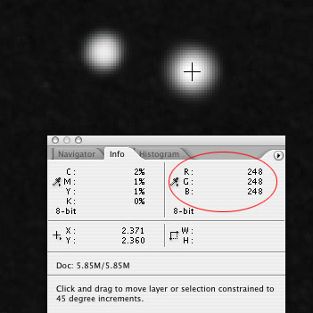
Figure 7
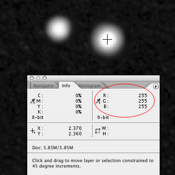
Figure 8
Step 6 – Adjusting White Star Cores
While shaded gray areas on the fringes of stars are important for picking up the color you are going to add, pure white cores allow you to convey brightness. In the previous step, you made the cores of the bolder stars pure white. The bolder and brighter the star, the more pure white I like to have visible in the center. As you examine the image, if you need to expand that white area a bit, get a soft paint brush and adjust its size to allow you to softly paint white into the middle of the star (see Figure 9).
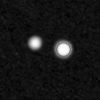
Figure 9
On the other hand, if the core of the star needs to have that white area constricted, you can use the blur tool to blur the inner edges of gray until they start to bleed further and further into the center (see Figure 10). You can also use the ‘Burn Tool’ to very softly darken the area.
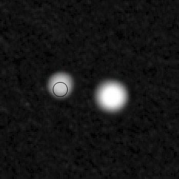
Figure 10
PAGE 2 OF 4
— First Page | Next Page —